As you can see, this is the movie poster me and my partner created for our horror movie trailer. We tried to make it fit a horror mise en scene and more will be explained below:
This was pretty straight forward to create ans we used Photoshop. This made it easy for us to create as we were fimiliar with using this software in the previous year during our construction of our music magazine.
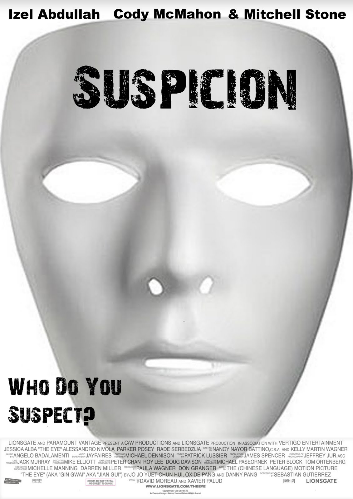
The first point me and my partner looked out for was the colour scheme. We wanted the colours to fit in well with the movie trailer so we matched the ancillary text colour with the movie poster. This made it have a horror feel about it and this is what we wanted to enforce on our audience. The next thing we done to make it a convincing horror poster was added the only image of the mask. This was put there to be a tell tale sign to our audience. This gives them an istant recognition as to what the film is and also represents the killer of our horror trailer. This, along with the film title will enable our audience to know what film is being advertised with just a glance at the movie poster.
We also chose to add a rhetorical question on the poster as we thought it would make the audience want to see the film. We added the question 'who do you suspect?' This will make the audience feel as if they want to find out who the culprit is which is good for us getting views. The last part we added was the smaller text. All film posters contain the banner accross the bottom of small text which inclued things such as the film make, director, actors etc. This is a common media trend and we thought it would be best to add it to ours to look professional.
Those were the reasons we chose different parts to add and why we done this. Overall, I think this is a convincing movie poster which was created in a very short space of time thanks to the software.
No comments:
Post a Comment